
Quora is a question-and-answer website where users can collaborate by editing questions and commenting on answers that have been submitted by other users.
It is quite popular and used by many people across the world for its quality content. In fact, India is second largest user-base for Quora with 15% of total users.
On Quora, each question on average will get 5 answers as per estimation. So, the Answering experience should be wonderful, right? I’ll give you a spoiler, it’s not.
It is quite popular and used by many people across the world (only) for its “quality content”
There’s a dedicated “Answer” page in Quora, it has a few questions ready to get Answered. But, I wanted to follow a more organic way of Answering a Question. That is, I picked a Question from the Homepage to Answer.
Highlights
Always remember the Fundamentals
All the applications we use every day have their own set of core functionalities. WhatsApp is for instant messaging; Twitter is for instant short news; YouTube is to stream videos and so on… In Quora’s case, it is a Question-Answer platform.
The above-listed applications stay so close to their fundamentals, even though they have other features. You can type a message in 2 clicks on WhatsApp, you can compose your tweet in 1 click, you can play a video in 1 click on YouTube. Not only the number of clicks, but they are also very straightforward and easy to access.
But, Quora wants to play a game with us before we write an Answer.
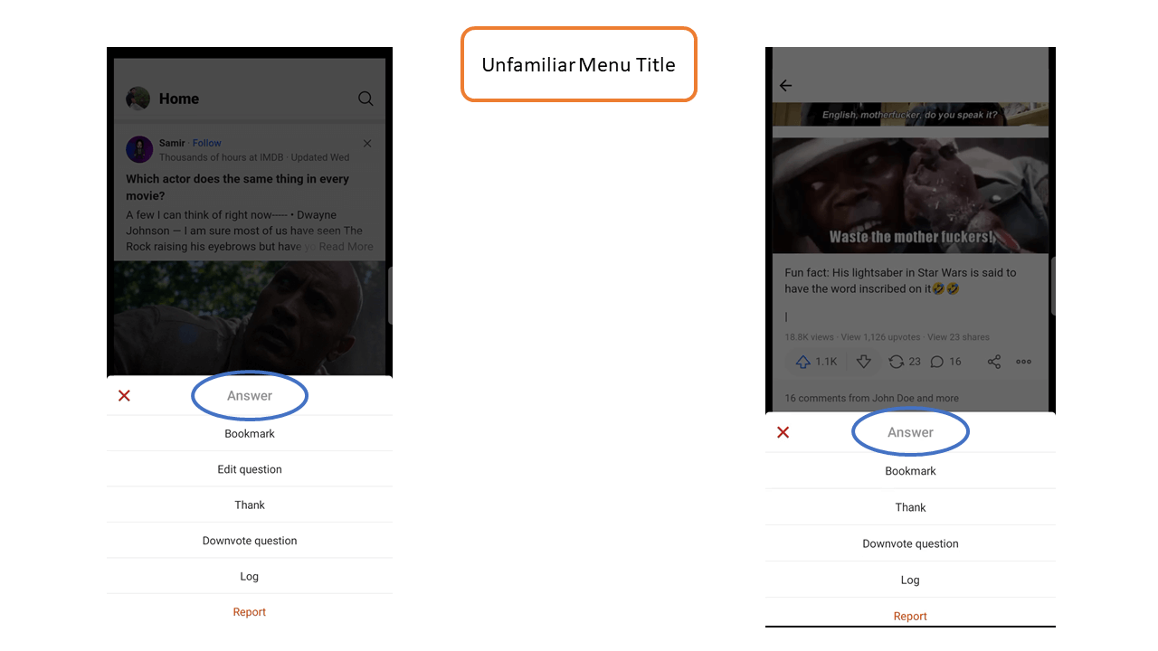
First, we have to open the answer written by someone else. Then, we have to open the Question page from a hidden link. And at last, we were left to get confused with “twins-like” options.

See, the most common and organic way to convert a Reader into an Answerer is to let them pick a question that inspires them the most. The job of the UX is to help the user achieve it. Instead, quora seem to be creating hurdles to prevent the user from achieving it.
Be Familiar and Clear
A user doesn’t want to think or guess to make interactions with the application.
To achieve that, the design should be very familiar.
WhatsApp, Telegram, iMessage, or whatever messaging app you take, will have a textbox at the bottom with a Send button to its right for sending a message. This is not because there are no other design options. But, this is essential to provide a familiar design to the user for easier adoption.
Quora designers might have confused with this.
They abstracted the options in the menu, button names, and the “Credentials section” thinking the users are familiar with it.
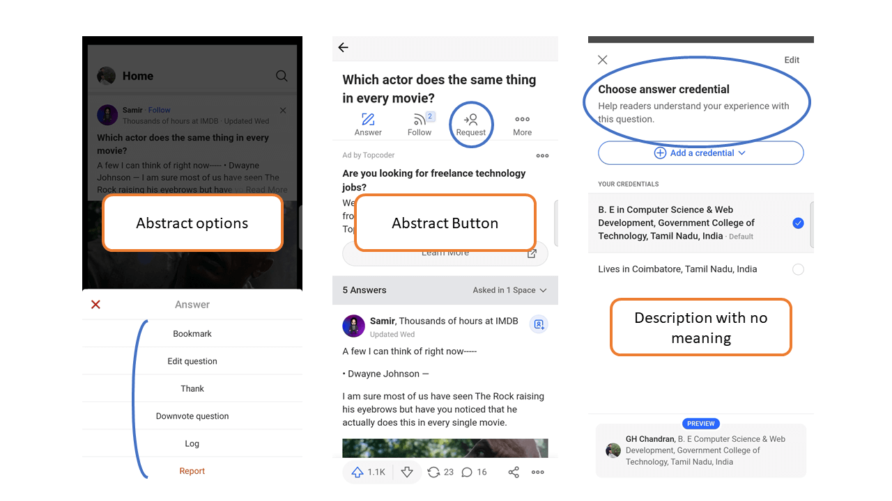
And, they provided a title to the Menu which is easy to get confused with a button and takes the user away from a familiar design.
These elements will make the application difficult to use.
Clean writing experience
We already repeated this several times, “Answering Questions” is the core of Quora.
And this is the one place where they are true to their core, writing Answers.
This is the place where the user becomes an Author, so the environment should be minimal and distraction-free. Quora did just that.
They handled the validations right, gave text-editing features in a familiar design. So everything works very well together.
Sense of accomplishment
Why should a user sit up for hours and write long and lengthy answers to a random question? To get a sense of accomplishment, right?
It is said to be a bad design if an application fails to deliver that.
But Quora gave us something more than a bad design could ever give, a sense of frustration.
Right after clicking the Post button, the app jumps between a few pages and landed on a new page that I’ve never seen. It asked a few dumb questions, without any context. Only past that page, I came to know that my Answer was posted already.
I didn’t even know that my Answer was already posted.
This totally ruins the experience. There should be a Preview page where the user could go through the content he/she wrote. Actually, Previewing allows the author to spot mistakes and make corrections before any public spots them.
Once the Answer has been posted, the user expects to see the work that he/she worked on. Seeing their work from the eyes of an audience creates the magic of a “sense of accomplishment”. This is missing in Quora.