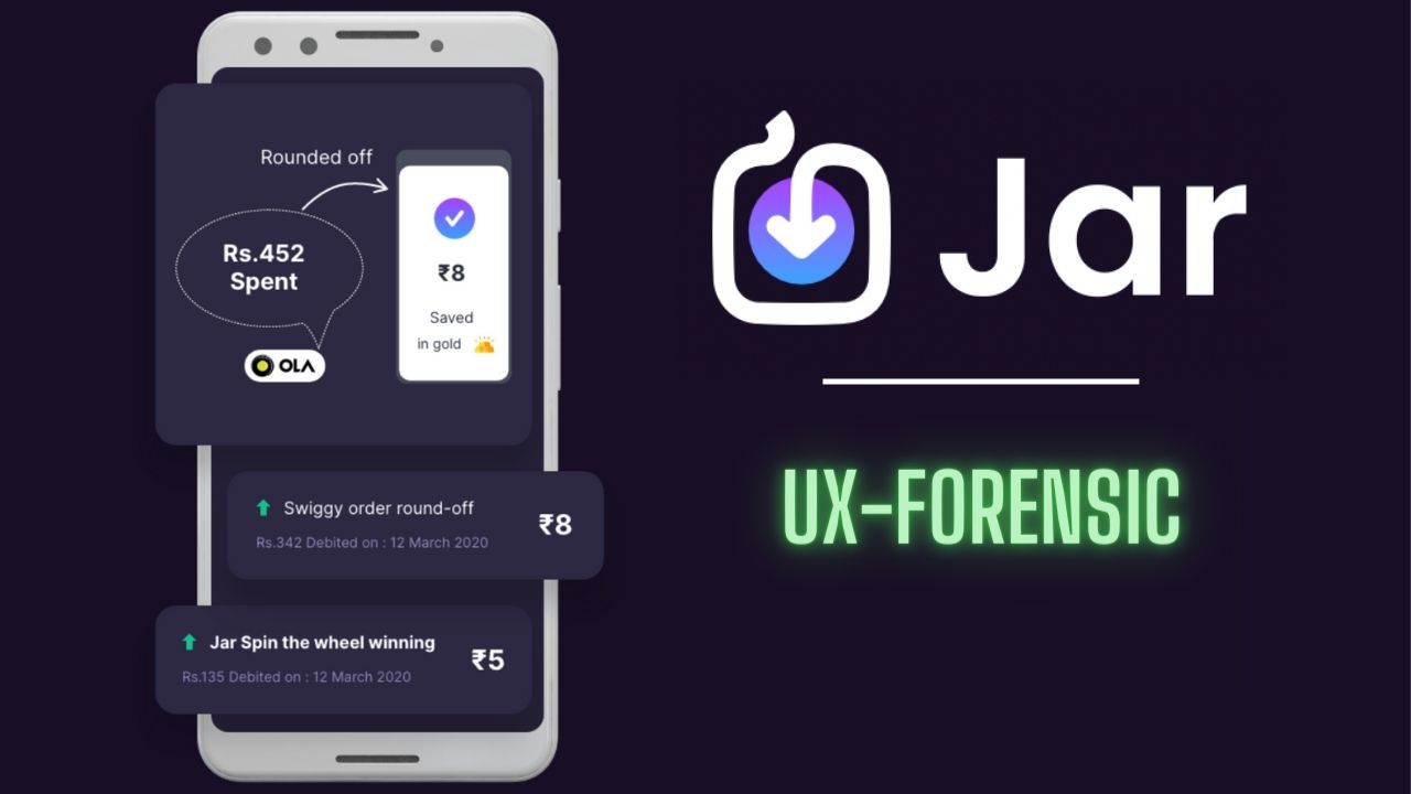
Jar is a daily gold savings app, which invests your spare changes from your online transactions into digital gold. It does this by reading your transaction SMS and asking you to round off the spend and invest the balance.
Here the investment happens daily, not once a month. The user doesn’t need a large sum of money to start investing, the spare changes are enough. The app determines the amount to invest, not the user.
Actually, the idea here is exactly the opposite of the traditional investment options.
So, it comes with an overhead of educating the user when something happens exactly opposite to what is being followed.
So, this case study focuses more on how an App educates the user when it’s the first of its kind, rather than just usability testing.
Highlights
Abducted Happiness
This is the first time the user opens up the app with all the excitement. Both the user and the app know that he is at Step 0, and getting ready to step up.
So, the message should encourage the user to get started.
But what Jar did felt like…

Not just once, Jar did this another time when I was so happy about my first investment. It came at the end and said I won 0 spins for a game that I didn’t even know existed.
See these are the moments that create some excitement in the user.
Handling excitement is a double-edged sword. Engagement and Disappointment are the two edges of it.
Instead of telling the user has nothing, Jar should have an empty state with a message that encourages him to start investing.
What would a user do with Spin rewards when he doesn’t know what to do with them? So Jar should’ve introduced the game first and told the user why would he want Spin rewards to play.
Misunderstood onboarding
Onboarding is not just getting inputs from the user and creating an account. Onboarding is getting the user ready to use the app.
When a user first lands on the app, it should not throw all the action items at once and confuse him on where to go first.
The action items should be revealed one after the other, without any hurry. So that the user knows the importance of each action and can make a better decision. And obviously have a peaceful journey.
Actually, Jar did this during the sign-up process. Each input has its own section, and each comes one after the other.
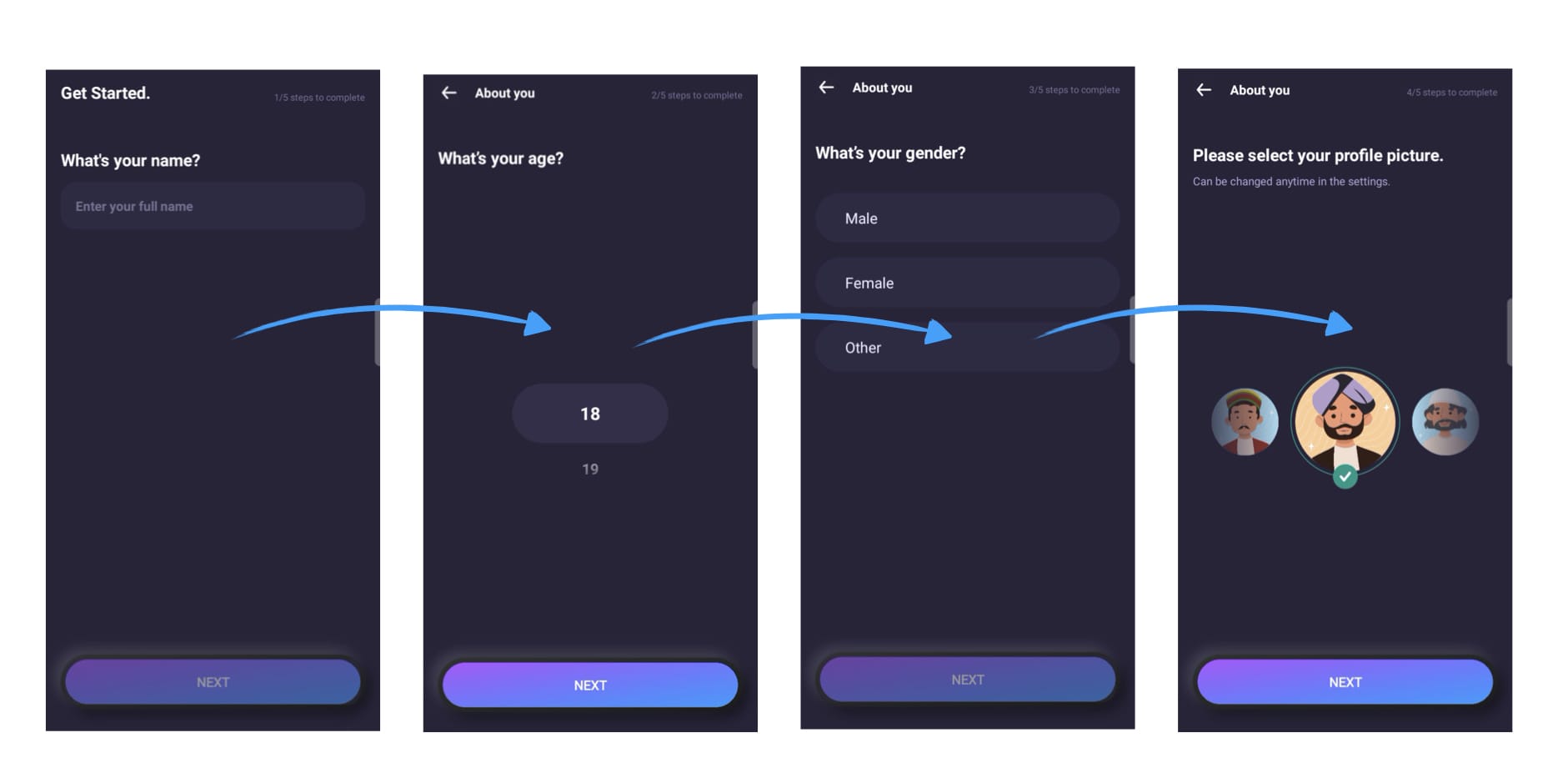
If the Homepage also followed a similar structure by revealing one action item after the other, the onboarding would’ve been much better.
Reflect the Goal
The goal of a product should be reflected in its design. Jar’s goal is to re-introduce the concept of Piggy banking to this Generation.
This means the user has to make daily small investments.
Jar can successfully calculate the investment amounts. But, the user has to visit Jar for making that investment, without missing a day.
If he fails to open the app for a week, the total amount to invest gets higher and higher. Which ultimately breaks the goal of the app.
- It is not a daily investment because the user failed to invest daily.
- It is not a small investment because the total amount keeps increasing if he doesn’t open the app.
Jar even has a solution for this, Auto-Pay, but the user has to search for it to enable it.
That is, the goal of a product is very very important. The app should do this first and make it sustainable.
Else the app will lose its identity.
Summary
Jar has a distinctive idea, and the right technology to make the idea possible.
But, because of not self-realizing their uniqueness and being lethargic in educating the users spoils the whole app.
If they haven’t educated the user properly, the user has to learn everything by experience. Which is very bad for a finance app, and affects the conversions very badly.
This is just an app for the user, not a life to learn by experience.
So, finally, Jar joins the list and becomes a classic example of an innovative idea being killed by poor implementation.