Acko is an Insurance management (InsurTech) firm, which follows an online-led model. Hence, they use Digital Platforms for all the operations of the company.
Acko set out to make buying and claiming insurance to be simple and convenient by going 100% digital. This aspiration paid them off with 50 Million unique customers in a span of three years.
So, to test what Acko claims to be “100% digital”, I did the most basic thing from an Insurance company. Buying an Insurance for my Bike.
Acko did a wonderful job at buying Insurance, it is dead simple compared to non-digital routes. But when seeing it as a 100% digital product, it has few hiccups all the way.
Highlights
Progress bars are win-win
We won’t take a ride without knowing the distance.
Similarly, a user won’t like to start a “journey” without knowing how long it is.
But the “compulsive CTAs” ignites-the-fire without letting the user know how long actually it is.

Now, it becomes the UX’s responsibility to let the user know how long it is. So, the most common approach to show the total length and its progress is by using a Progress Bar.
A user could:
- predict the duration/effort that the journey could take
- get ready for the next step
- be more peaceful throughout the journey
And the company could market its product as “Get your bike insured in 5 clicks”.
So, it’s a win-win for all just by adding a Progress bar.
Unexpected behaviors
You won’t be expecting the sugar in your coffee to be right all the time. You’ll realize it only when you have a sip and find it is not right.
That is, our minds expect certain things to happen subconsciously. If it occurs, nothing happens. Else it feels odd.
Here, Acko broke these user expectations in three places:
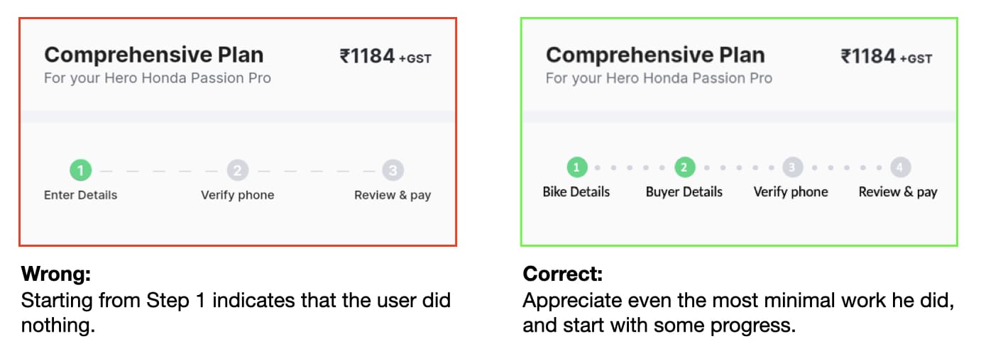
- The user has already started his journey long back, a progress bar comes from nowhere and says that he is still at Step 1. As he invested lots of time in it, he “expects” some progress in his work.
The review page is there to review and correct the previous inputs. And here is where the user “expects” an option to Edit them. Acko did the reverse by giving Edit options on all pages except the Review page.
The purpose of the Review & Pay page is also to review the cost. The user “expects” to see the split-up of the amount if taxes are involved. Surprisingly, it was shown only on the next page, where the user selects his “Payment Method”.

Context Matters
In cooking, chefs used to add a pinch of salt to boost the taste of the dish.
I guess the designer who designed the IDV page must be a former chef. He added something out of context to a wonderful page.

The title, description, pre-selected value, and slider ranges are all related to the value. But, they introduced a new term called “Risk”, which has no relationship with anything on that page.

It should be Value instead of Risk, because we are updating the cost, not the Risk.
To provide a seamless experience, the contents shown on each page should be easily relatable.
It will only create confusion if something unrelated comes up.
Summary
Acko’s goal is to simplify Insurance management, and their efforts are easily visible. I had to provide very few inputs, the insurer’s name is brilliantly pulled from my previous insurance and I also got a pretty good IDV for my bike.
But, there were a lot of frictions along the way. It is yes, 100% digital. But not 100% enjoyable.