Instant delivery is becoming a hot thing in India recently. Dunzo, BlinkIt, Amazon Fresh, and many more new startups are in the action.
Swiggy already is a leading instant food delivery company in India and has a very large user base too. So, Swiggy has an upper hand over its competition and hence brought in “Swiggy Genie”.
Swiggy Genie provides two options for instant delivery,
- Pick & Drop - to get anything from one place to another (it can get your lunch box from your home if you forgot it)
- Buy from any Store - to make a list of anything you want and get it delivered (it can deliver your monthly grocery)
But, to win this race, having a strong user base is not enough. A strong User Experience to make the users want more is also required.
Swiggy’s UX is great, one of the best actually. Swiggy Genie is also great, but partially.
Highlights
Hidden Offer
Any brand gives away offers for two reasons,
- To increase the sale
- To increase user retention
Thus, offers are used for adding value to customers and tying them closer to the brand.
And, the user should have the “feel” of getting more value from these offers.
To get that feel, placing the offer at the right place and giving it away at the right time is very very important.
To pull in new users and educate the existing user about the offers, it should get more attention first. For that, designers use high contrast colors and place the offer in a distinct place to get more attention.
But, Swiggy here placed the offer in a very crowded place without a clear distinction from the group.

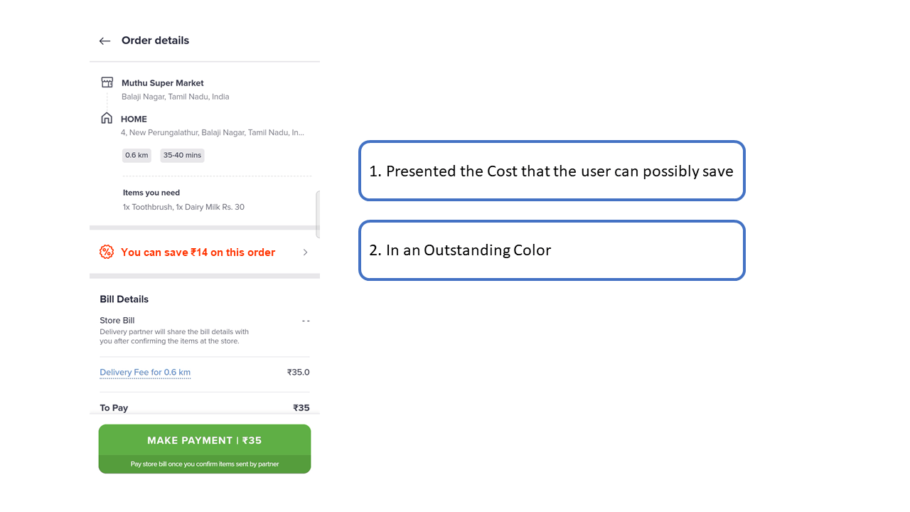
Two, the user should be able to take value from the offer. In our case, the price cut for the order should add value to the user. So, the Checkout page is the right place to reveal the offer and impress the users.
But, Swiggy was very subtle in revealing the offer on the Checkout page. They hid all the offers under a button which is very easy to miss.

They should show the final price of the order after applying the offers without a click from the user. If there are more offers available, an estimation of the savings in a distinct color should be used. Like below,
The Selection Perfection
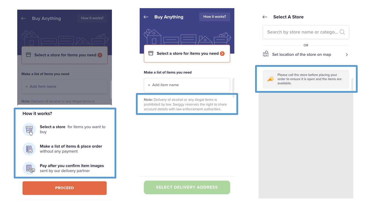
All the elements of Swiggy depend on the user’s address. So, that should be the first input from the User. But prompting the user for input even before he starts the journey is a bad idea.
So, the input should be as minimal as possible to cut the negative impact on the user. Hence, Swiggy takes in only one click from us.
Do you think one will have enough time to think about which address to deliver with a mind full of biriyani? Absolutely not.
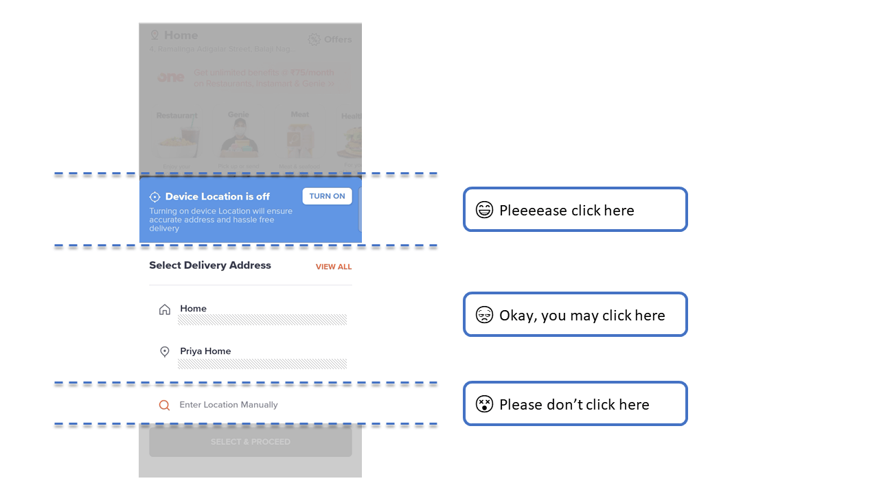
The emphasis given to the first option comes in and removes “that” thinking out of the user’s mind. And the other two options with their respective emphasis takes-in respective attention.
So to summarize, Swiggy gives us a masterclass on how to get the Primary inputs from the user.
Very well done.
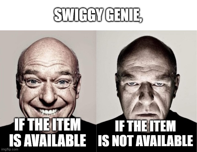
Initial fee Tragedy
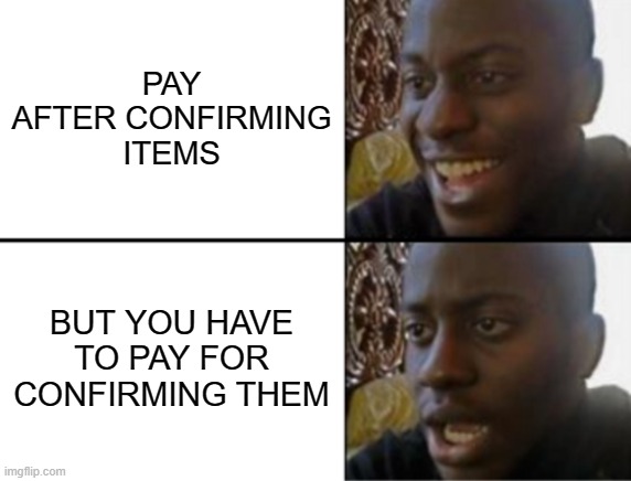
This is the first time I’m using Swiggy Genie, I don’t know the procedure very well. So, I went through the steps quickly, and then I added the items and clicked “Proceed”. There comes a Payment request for my surprise.
Until then I had no idea that I have to pay before placing the order. So, irrespective of knowing whether the item that I ordered is available or not, I have to pay them an initial fee.
Did they explain why I’m paying this amount? Did they mention anywhere that I have to pay this Initial fee? Did they explain that there is no refund for this payment? Did they explain what will happen if the item that I ordered is not available?
A Big NO to all the above questions.
Here, Swiggy traded off the user experience for economics. Swiggy Genie could know the availability of the item only after the partner goes to the shop.
So, Swiggy collects the money just to check if the item that we added is available or not.
Both the user and Swiggy don’t know whether the item is available or not until the partner goes there. If the item is available, Swiggy collects the cost of that item and delivers. If the item is not available, Swiggy Genie flies away with the Initial fee.
The user should know this Risk before placing an order.
No Warnings. No Loadings
A warning is a message to state the risks that are ahead with a certain action. Loading state is a change of element that indicates progress in an action and its response.
Swiggy Genie’s Confirmation page is a great example of what will happen if we miss these elements.
Once the Item images came in for confirmation, we were left with no help. Swiggy gave us no warning that clicking on the Images will confirm them and we cannot cancel them after confirmation. It just asks whether do we need it or not.
This is the final place where the user could have control over the items that he ordered. So, this is the action that will determine whether we will get that item or not.
But without any warnings or helper messages, Swiggy fails to pass that importance to the user.
This is very disappointing for an app that educates the users before any possible action.
Once I clicked on the Confirm button, the text should change to “Confirmed”. But, the duration to change the text will differ based on network conditions.
To fill that gap, loading animations are used. If it is not used, the text won’t change for some time and the user may do unnecessary actions meanwhile. Like I rejected the already confirmed item.
Guideless Roads
Imagine, you search for UX-Forensic in google and get results for US Forensics. It creates two issues there,
- The user will never open that result because it is irrelevant.
- The user will open it, but cannot read anything in it because it will ask him to log in.
So, those irrelevant and inaccessible results should be filtered out. Right?
Similarly, what will a user do if he sees “Chennai Bus Stand” when he searches for Chennai B…(akery)?
Someone like me will order a couple of Government buses from the Bus Stand.

Actually, this is possible with Swiggy Genie.
- It has no filters to show only the shops.
- It has no validations/guidelines for what to order.
When a Bus stand is not a shop, why should Swiggy show that to the user? Showing these irrelevant data will come with unpredictable impacts.
So, the user should see only shops when he searches. Swiggy should filter out all the other irrelevant data.
Swiggy Genie markets itself as “Anything you need, delivered”, but can it deliver “anything”?
If it can’t deliver everything, it should be able to inspect if the Item that the user entered is deliverable or not. Or Swiggy should at least give some guidelines to the user before adding an Item.
Without these parts, Swiggy Genie feels incomplete.